Design your own art project 4-24-17
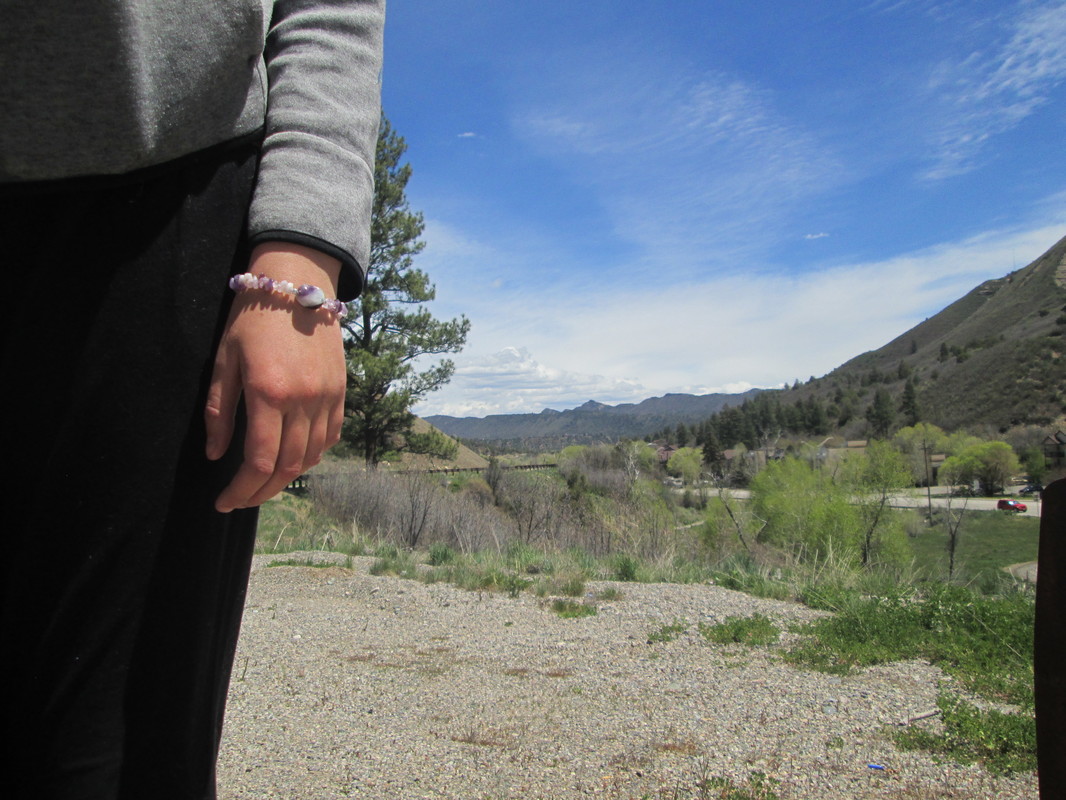
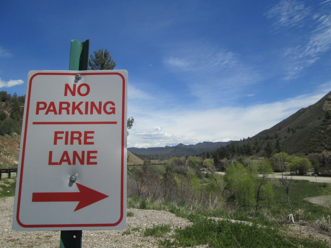
Project description: For this project, we chose something that we were interested in and then researched that subject. I chose to do landscape photography. During the research section of this project, I learned about different techniques to use while doing landscape photos. Then I went and did some trial and error with taking the photos. I got critique and refinement pieces from peers on my products and went back and refined.
Pre Assessment:
|
Final Pieces: |
Logo Project 1-30-17
|
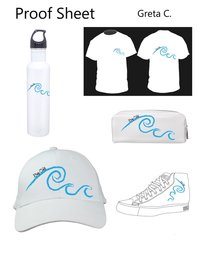
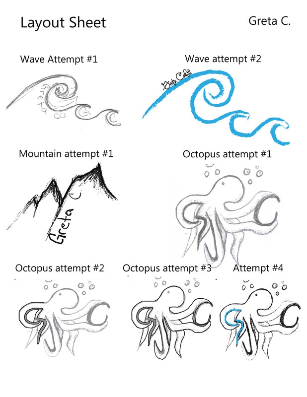
For my final logo, I decided to go simple and use the ocean as my basis. I did the ocean because I am very interested in marine biology and learning about environmental science. I have always wanted to study the ocean, so if I were to have design a logo for a future company. I thought that the wave would be a perfect fit for that. Also with the wave, I could play with texture by using a live trace tool. This gave me a cool texture that made my logo look more like a painting. I love the creative touch on my logo, and I am proud of my texture, balance, and color choices. In this project I learned how to use the scanners and live trace my sketches into something cooler. I learned this by using a new program that I am learning about, Adobe Illustrator. You do this by cropping your scanned sketch and opening it in illustrator. From there you select live trace and choose a type of live trace. Then you can use different colors and text to personalize your logo. Finally you place your logo on a proof sheet on t-shirts, water bottles, etc. One key thing that I will take away from this project is how to create a simplistic design to portray a quick message about a company. I will use this if I need to present something in a quick presentation. I could also use it as a metaphor that I could explain something. I went through multiple logos, which went through mountains, octopuses, and waves. I would put my sketch into illustrator and went through all the live trace options. If that didn't work, I would begin to use the pen tool and go through the different strokes on that. If nothing was sufficient, I would move onto my next logo. I did this about three times. Then after that, I put my final logo on blank hats and such, and I was done. |
First stage sketches:
Final logo:
|
Photoshop Tutorials Mini Project, 11-30-2016
Before: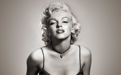
|
How tools did I use?On this tutorial, I used the poser edges tool, I also used the color halftone and changed the maximum radius to six. I used this tutorial.
|
After Pop Art Tutorial: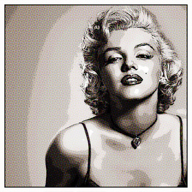
|
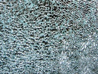
Before:
|
What tools did I use?I first placed the glass over the person. I resized the image to fit the person's face, and changed the the normal to multiply on my layer. Then I just earased to my liking. Click here for the tutorial that I used!
|
After the How to Crack/Peel Face Tutorial: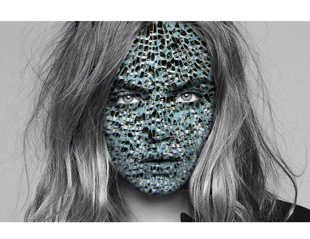
|
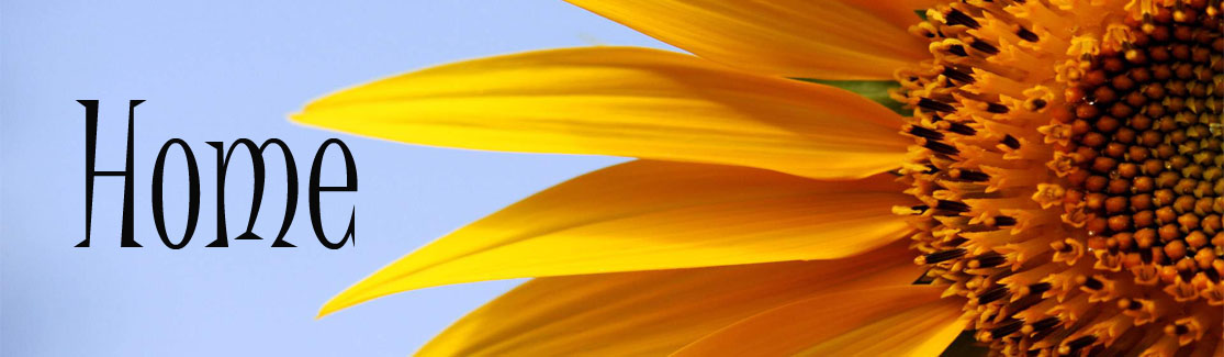
Digital Portfolio Header Project, 10-03-16:
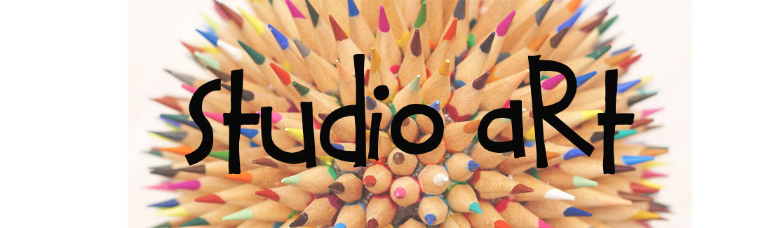
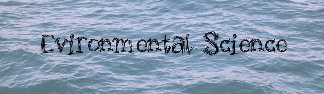
During this first Digital Art project. we learned and crafted personalized headers to make our digital portfolios' more interesting to look at. We looked through free font sites and installed them to our computer. These are the original picture I used for my header's (left) and the final product (right).
Home page: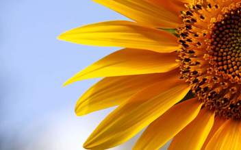
Humanities:
|

|
Physics:

|

|
Math 1:
|

|
Digital Art:
|

|
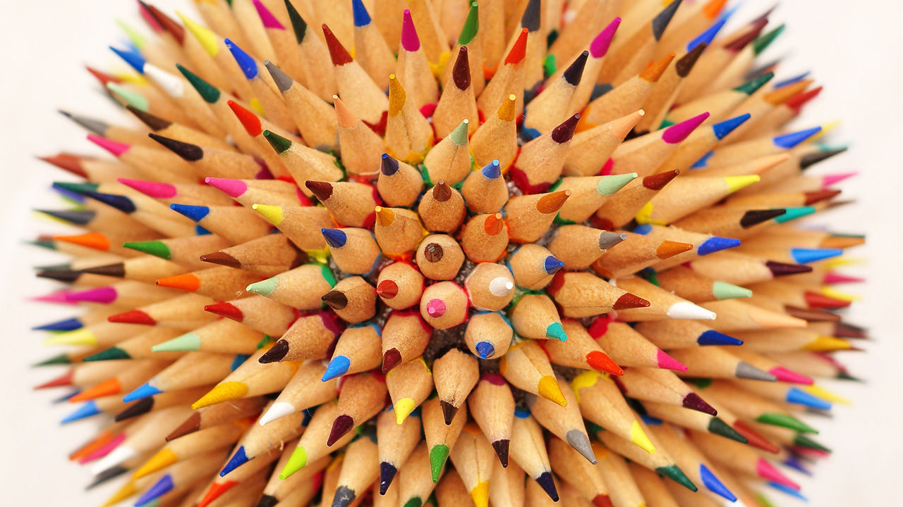
Studio Art:
|
|
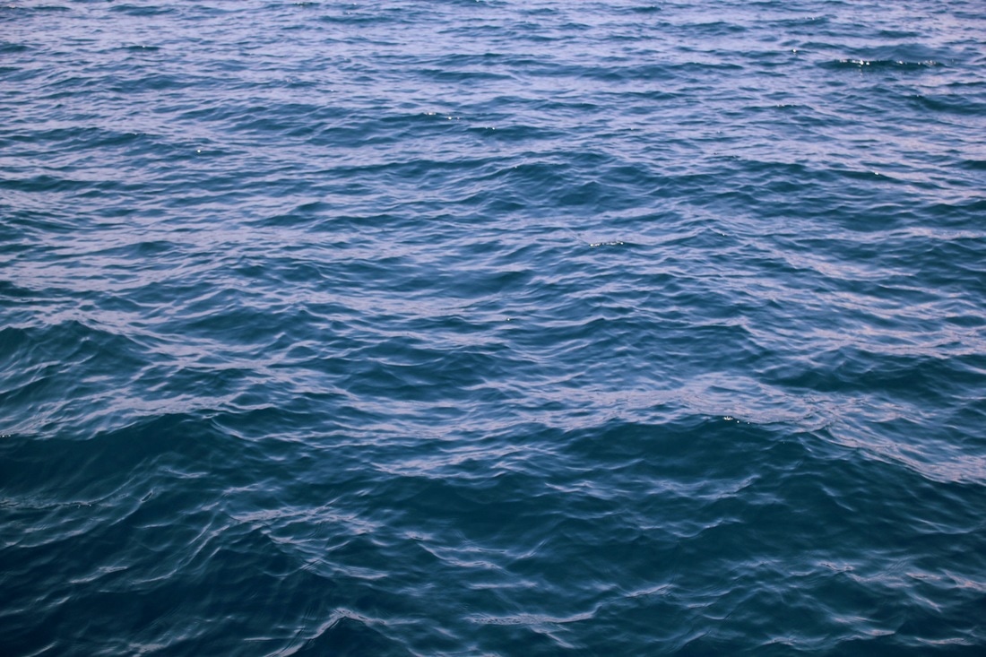
Environmental Science:
|
|
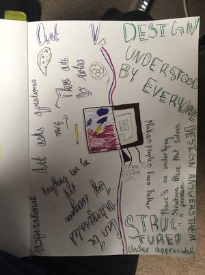
Art Vs. Design Mini Project, 9-20-16:
This is the first project of the year! We read and annotated articles about art and design, and discussed as a class. Then we did an art project to reflect the differences of the two.